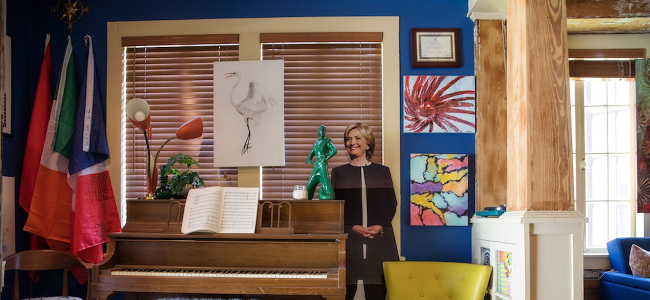
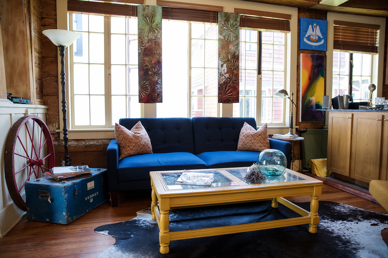
Every time Garrett Kemp travels, he brings home a memento to remind him of the experience. He always gets a flag from each new country he visits. He usually brings back locally made art, too.
Kemp owns The Market at Circa 1857 in Mid City, so he has an eye for eclectic pieces. And when he returns from work each evening, the first thing he sees in his Spanish Town home is his own entryway gallery.
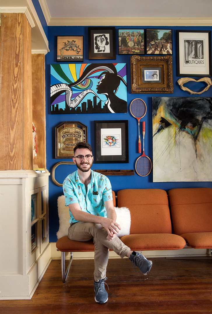
“I’ve always been a big fan of art, and I’ve been making art as long as I can remember,” he says. “As soon as I came into my business, I started collecting.”
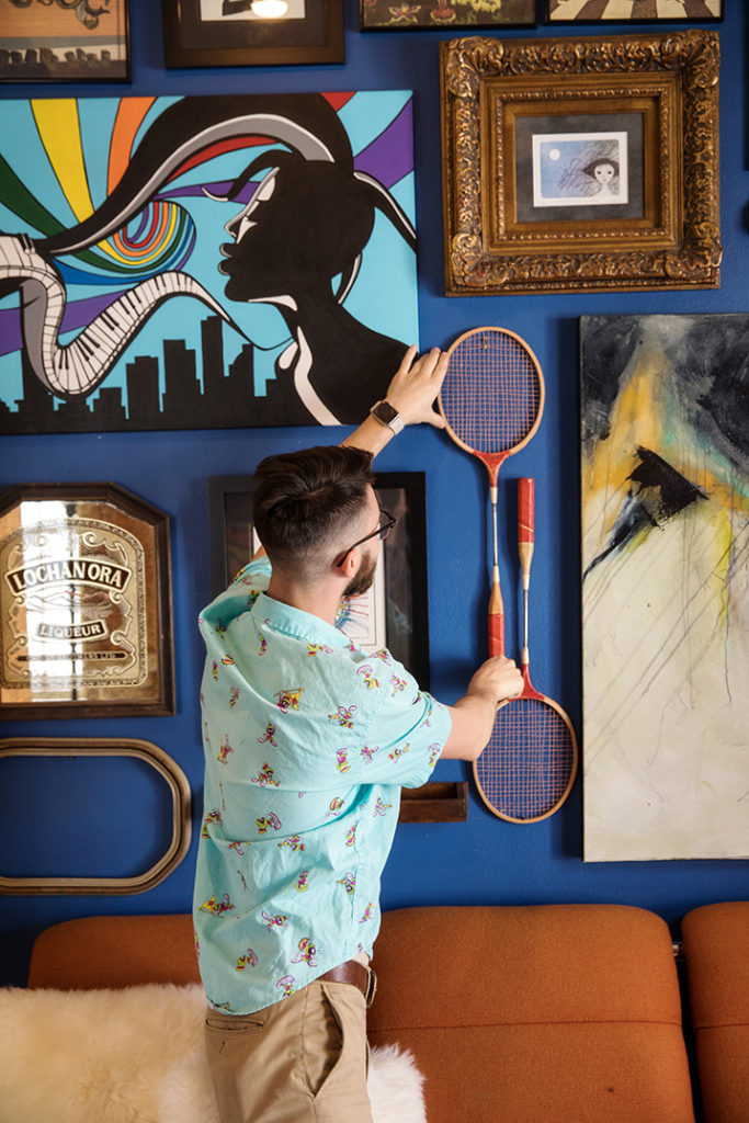
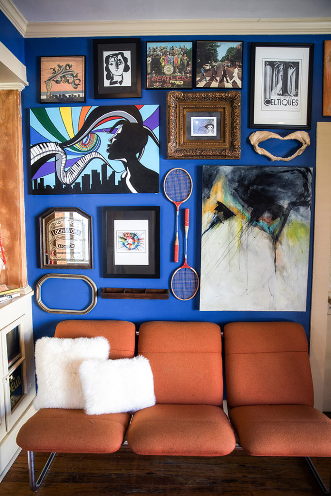
Kemp began his gallery wall because he was running out of space to hang all his art. Instead of hanging an individual piece on each wall around his house, he decided to display a bunch of them together.
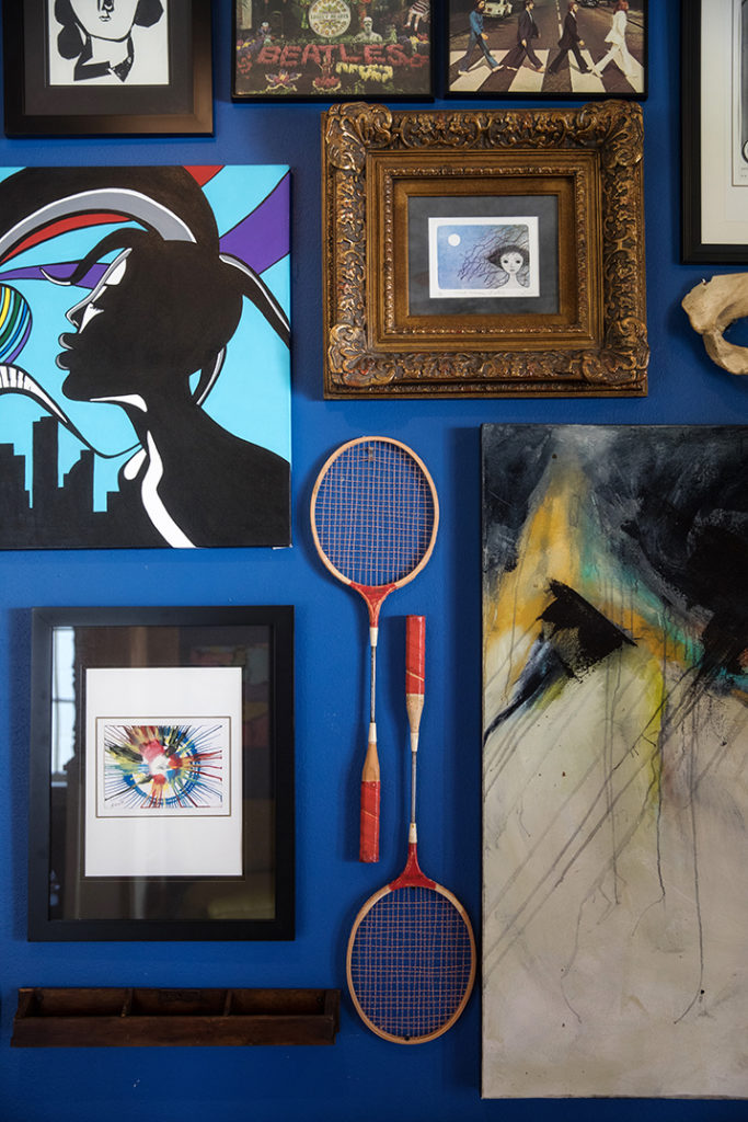
The Baton Rouge native spent several days designing the layout of objects on his gallery wall. He arranged and rearranged around 15 pieces, “an eclectic hodgepodge” of items reflecting his interests, style and experiences.
“For the first few weeks, I kept swapping things out,” he says.
While gallery walls are common in living rooms or entryways, Kemp says they can work in any room. He’s even seen them around town in restaurant bathrooms.
Kemp switches out pieces on his wall often, whenever he buys something new or just needs a refresh. Although he may run out of space, he prefers a slightly busy look to having nothing on his walls.
“Blank walls feel sterile. They’re not cozy or comfortable,” he says. “With my gallery wall, I can walk past, gaze at an item, and it brings back memories of my experiences. … It reminds me, ‘I made that my freshman year,’ or ‘I got that on a trip to Morocco.’ And when people come into your home, you can share those stories visually on your wall. Those memories take on a life of their own.”
DESIGN YOUR WALL
1. Find a good starting point—but not in the center. Kemp starts in a corner and works from there. “It fits together like a puzzle,” he says, “and you don’t start a puzzle in the center.”
2. Begin with a signature piece, and fill the space around that. One of the first pieces Kemp purchased—an acrylic on canvas by his friend Jade Brady—is the focal point of his gallery.
3. Keep the spacing tight. Kemp suggests leaving no more than 5 inches between items in order to maximize the amount of usable wall space.
4. Symmetry is not required. Some displays work well in a neat grid arrangement. But if you have items of different shapes and sizes, have fun with the layout.
5. Tell your story. “Put what makes you happy and comfortable on your wall,” he says.
See more photos from Kemp’s home in our gallery below:
This article was originally published in the 225 Extra: 2018 Spaces & Places issue. Click here to read more articles from this issue.


